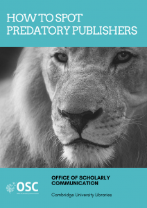
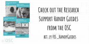
If there is one thing I’ve learnt over the last few years of training library staff it’s that they really love a handout! Whether it contains extra information or a copy of the slides, in print or as a digital document, they really want something tangible to take away from a training session and refer back to. However I’m also a realist and I know that many of these handouts end their lives in a desk drawer never to be seen again so I wanted to create something that would be both attention grabbing and useful. Our series of Research Support Handy Guides were born as a result.
 These short, four page guides are designed to be used as mini-booklets which summarise complex topics related to scholarly communication in an accessible way. They all follow a fairly consistent format with an eye-catching cover, a short synopsis of the topic, a list of factors to consider and links to further information. Having a page limit means that only the most important information can be included and this forces me to think about what people really need to know about a topic. It also means that I need to use clear language rather than lots of text which really helps me to distill a topic to its most important point. Although the guides are aimed at library staff we have discovered that they have other uses. All of the guides are made available under a CC-BY 4.0 licence on our website so that people can adapt the information as needed and we have added downloadable versions upon popular demand. Library staff are able to print these out or add them to their own websites as resources for researchers which saves them time having to come up with similar content from scratch and reinventing the wheel. The guides are also available via the online publication tool ISSUU which opens them up to a wider audience and makes them interactive. It doesn’t hurt that all of this provides a bit of stealth advocacy for the OSC either! I designed the guides using Canva. If you have never come across this site before I thoroughly recommend checking it out as it makes designing good looking materials really easy. I often have an idea in my head of how I want something to look but I can never quite seem to translate that to the (digital) page. Canva provides lots of support, graphics and importantly templates to help you create really engaging materials. I simple chose an appropriate template, uploaded some (CC0) images, edited the colours to reflect our palette and added the text.
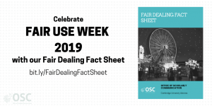
So far there are eight guides in the series covering topics from data management plans to peer review. The guides are often created in direct response to a need identified by our library community – something that often happens when someone starts a sentence with the phrase “I wish I knew more about…”  Some guides are created to tie in with an event such as Open Access Week or the recent Fair Use Week. One topic which is particularly suited to this format is copyright and there are currently three guides where it features heavily: Academic Social Networks, Anatomy of a Creative Commons License and the Fair Dealing Fact Sheet. This last title covers a topic that often causes confusion for both researchers and librarians and has been particularly useful to produce in our recent information sessions on copyright Based on the positive reaction I have received both in person and online I think more copyright related titles will definitely be added to the series!
If anyone else is thinking of using something similar I would definitely say give it a try. The guides have proved popular with both the Cambridge library community and those further afield and there have been over 3000 hits across all titles so far plus it’s always useful to have something ready to hand out at events or to point to when asked a question.  Although much of the information has been adapted from existing information on our webpages the guides offer a much more accessible and visually appealing format that reading pages of dense text. There are lots of different design tools available to help and of course you might just have more talent than me! Creating something that looks professional is surprisingly easy and can really help to engage users in complex topics and potentially be used as a way to start a longer conversation – and you never know where that might lead.
Published 19 March 2019
Written by Claire Sewell

This blog was originally published on UK Copyright Literacy, 15 March 2019